I Built a Shared Component Library to Standardize UI Across a 2-Year-Old Codebase
As frontends grow, the real challenge shifts from shipping features to maintaining consistency. Here is how I built a shared component library that standardized UI across a large codebase — the architecture, the migration, and the engineering challenges nobody talks about.
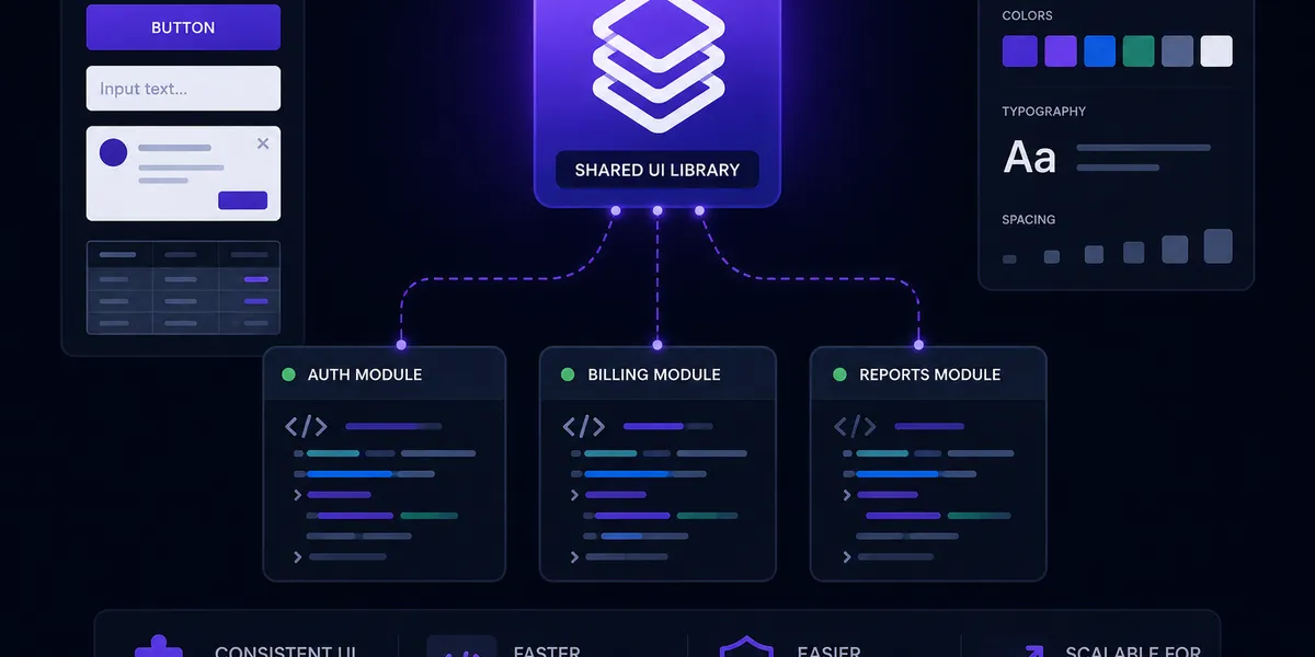
As frontend applications grow, the real challenge shifts from shipping new features to maintaining consistency across teams, repositories, and release cycles.
Over two years, our product had evolved into a large-scale codebase with duplicated UI implementations, inconsistent styling patterns, and different component behaviours across applications. Small UI changes became expensive. Onboarding was slower. Design consistency was drifting.
The solution wasn’t a new framework or a rewrite. It was a centralized component library — built from the ground up, incrementally adopted, and enforced through tooling.
Here’s how it went.
The Problem
A shared codebase without a shared design language creates a specific kind of debt: invisible at first, painful at scale.
By the time we felt it, we had:
- 90+ legacy components implemented independently across applications — same function, different APIs, different behaviour
- Duplicated styling — margins, colours, and spacing defined ad hoc in each feature rather than pulled from a token system
- Inconsistent patterns — a button here, a button there, styled slightly differently, tested differently, maintained separately
- Slow onboarding — new engineers spent days understanding which component to use and where it lived
The cost wasn’t technical debt in the abstract. It was real: features took longer to ship, PRs took longer to review, and design → implementation gaps kept widening.
The Objectives
Before writing a line of code, I defined what success looked like:
- Standardize UI across all frontend applications
- Eliminate duplicated component implementations
- Give engineering and design a single source of truth
- Improve scalability, maintainability, and long-term performance
- Reinforce consistent frontend patterns across the team
A component library isn’t just a UI project — it’s infrastructure. Treating it as anything less sets it up to fail.
What I Built
The Library Package
A reusable shared UI package published internally via GitHub Packages. Any application in the org can install it as a versioned npm dependency — same as any external library.
The stack: React + TypeScript + Tailwind CSS + shadcn/ui.
shadcn gave us accessible, composable primitives (built on Radix UI) without locking us into an opinionated component API. We owned the code, extended it as needed, and built our design tokens on top.
Storybook + Chromatic
Every component lives in Storybook — isolated, documented, and interactive. Engineers can explore components without running the full application. Designers can review implementations without a development environment.
Chromatic added visual regression testing on every PR. Any unintended visual change — a 2px padding shift, a colour drift — gets caught before it reaches production.
Versioning and CI/CD with Changesets
Manual versioning is a maintenance trap. I set up Changesets to manage versioning automatically:
- A developer adds a changeset file describing what changed
- On merge to
main, Changesets opens a Version PR with a bumped version and updated changelog - On merge of the Version PR, the package publishes to GitHub Packages automatically
No manual npm publish. No forgotten version bumps. No ambiguity about what changed between versions.
Unit Tests
Every component ships with tests written in Vitest + React Testing Library. The test coverage requirement was enforced at the CI level — a component without tests couldn’t merge.
The Real Engineering Challenge
The architecture is the easy part. The migration is where things get hard.
Refactoring 90+ Legacy Components
Decoupling business logic from UI is simple in theory. In practice, legacy components tend to be entangled: a <UserCard> that fetches its own data, renders its own loading state, and hardcodes its own styles.
The process for each component:
- Extract the pure UI — remove data fetching, context access, and side effects
- Define the API — what props does a reusable version need? What’s the minimum surface area?
- Standardize naming — align with the design system vocabulary
- Write tests — cover behaviour, not implementation
- Document in Storybook — with realistic stories, not just the happy path
Ninety-plus times.
Incremental Migration Without Disrupting Delivery
We couldn’t stop feature work to do a big-bang migration. So we didn’t.
The strategy was simple: new features use the library, legacy code migrates opportunistically. When a developer touched an old component for a feature or a bug fix, they migrated it as part of the same PR.
To prevent regression, we used ESLint rules and Husky pre-commit hooks that flagged direct imports of legacy components. Not hard blocks — flags that asked “did you mean to use the shared version?”
Over several months, the legacy components disappeared one by one.
Enforcing the Architecture
A shared library only works if people actually use it. Enforcement through culture alone doesn’t scale.
What worked:
- ESLint rules that prevented importing legacy component paths
- Husky hooks that ran lint checks before every commit
- CI checks that failed PRs importing deprecated implementations
- Storybook as the canonical reference — when in doubt, look it up there
The goal was to make the right thing the easy thing.
The Impact
After completing the migration across the application, the results were immediate and measurable:
Consistent UI across products. Every feature now uses the same components. Visual and behavioural inconsistencies are structurally impossible.
Faster feature delivery. Engineers reach for the library instead of rebuilding. A new form? Import <Input>, <Select>, <Button>. Done.
Easier maintenance. Update a component once, and everywhere benefits. Fix a focus ring in the shared <Button> — every button in the product is fixed.
Cleaner PR reviews. Reviewers focus on business logic, not whether the padding is right or the loading state matches the design.
Reduced duplication. Dozens of duplicate implementations replaced by a single canonical version each.
Better DX. Predictable APIs, typed props, documented stories, and reusable building blocks. New engineers are productive faster.
What I Learned
A component library is not a “UI nice-to-have.”
As products scale, it becomes infrastructure — the kind that keeps teams aligned, reduces technical debt, and accelerates development. The earlier you invest in standardization, the cheaper it is to maintain that consistency.
The hardest part isn’t building the library. It’s getting the migration right: incrementally, without breaking delivery, with tooling that makes the right choice the path of least resistance.
If you’re working on a growing frontend codebase and you’re starting to feel the friction — duplicated components, inconsistent patterns, slowing onboarding — this is probably the thing worth building next.